new decade, new t-shirt design
January 28th, 2010 - By admin
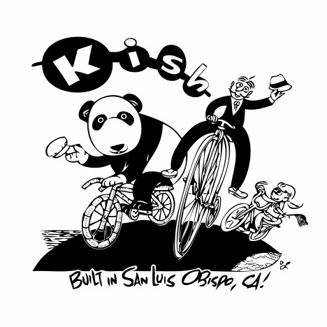
Unlike some other framebuilders, a lot more work happens in the shop here than in the Graphic Design Department, but after only offering the logo T’s for 15 years I have relented and have a brand spankin’ new design. Hopefully this will appease the masses of high-wheelin’ dandies, little girls and panda bears who have demanded representation.
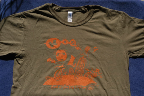
The men’s version is a fitted, ‘military’ green, with orange ink:
The ink stands out better than this lousy picture would lead you to believe, trust me.
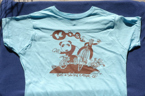
The women’s version is a fiited ‘girlie’ cut, powder blue with chocolate ink:
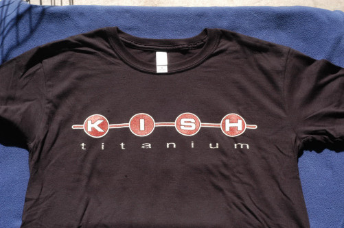
And the good ol’ logo T is available in the new fitted shirt, too:
All of these shirts are $20, inluding shipping in the USA.
Speaking of the ‘ol’ in ‘good ‘ol’, this logo of ours first appeared on the bikes in 1994, after a very boring Flintstones-esque scheme that lasted a couple of years. This logo is so popular, in fact, that it’s even been ripped off by another less-than-scrupulous ‘frame builder’! I won’t link to the unimaginative offender’s site, but anyone who has seen the ‘Custom Bicycles-A Passionate Pursuit‘ book, or has been to the NAHBS show and scratched their head wondering why the line through my name got squiggly and I started wearing collared shirts knows what I mean.
I’ve heard imitation in the sincerest form of flattery, but I’d be even more flattered to not see someone else’s name inside my logo on what otherwise look like perfectly fine bikes. Hey dude, there’s lots of other neat designs out there. If you can’t come up with anything, let me know and I’ll send you some files of a really great font that’s only mildly reminiscent of an old cartoon, rather than a brazen theft of another, longer-established frame building operation.


Wow
Why do you have to be so mean!
You’re right. I’m sorry. Calling those blue shirts ‘girlie’ was uncalled for.